wemay
Site Donor 2023
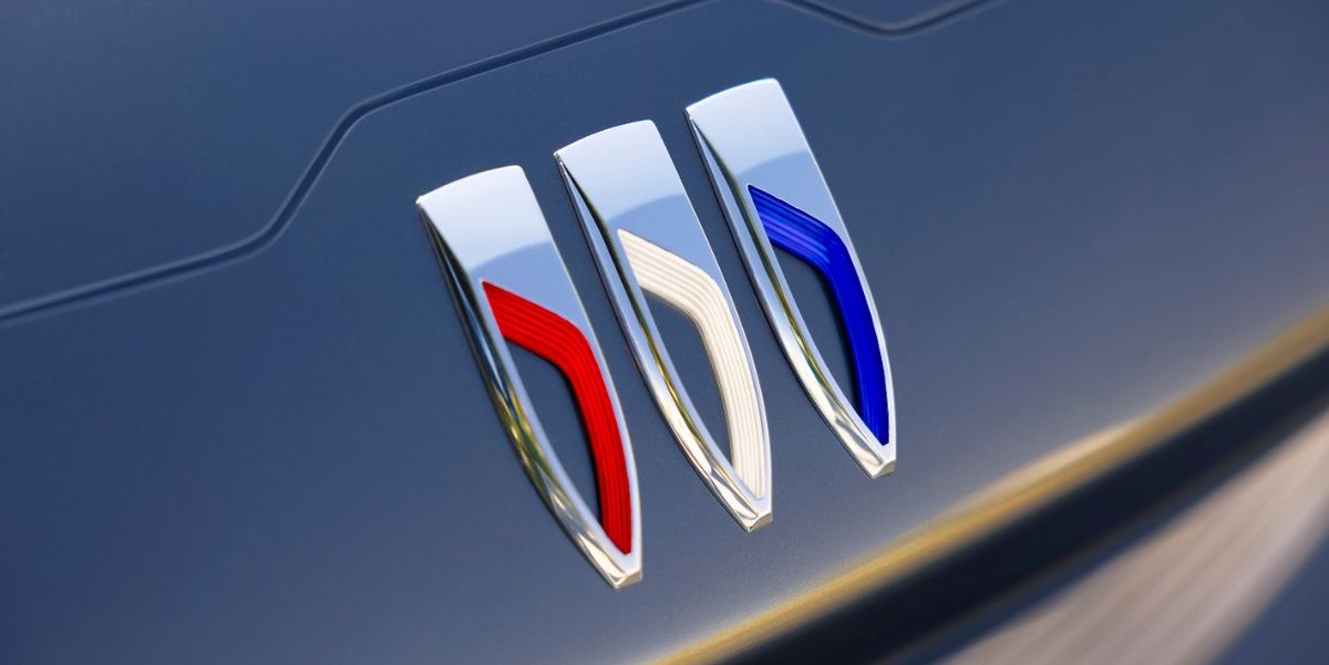
Buick Officially Adopts New Tri-Shield Logo
The redesigned emblem will first start appearing on Buick models in 2023.
 www.caranddriver.com
www.caranddriver.com
www.caranddriver.com
Does Buick still make vehicles? Sarcasm, but they sure don’t sell many here. The logo is fine, I guess.