Making the Highlights Darker Blue

Joined
Sep 18, 2002
Messages
6,056
Location
VA
I don't know exactly how to describe what I would like to see done in computer lingo. But I'll give it a go.

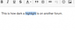
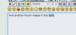
When I go back and try to highlight a word in my posting, I can barely see what I have highlighted. You know,
change spelling, remove a word, change a word, etc. It's this really pale blue that is very difficult for "me" to see.

Can we make the highlights darker? Maybe it is just me. Just a suggestion.
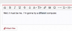
 
I’m posting so that I can edit and try and understand... it maybe it depends on your device/browser or your color selection. In BITOG blue, on my iPad, it’s pretty good contrast...please see the screenshot.
 

Attachments

  • C64EE78F-1245-444D-B857-2CCDB5E689F5.png
    C64EE78F-1245-444D-B857-2CCDB5E689F5.png
    137.7 KB · Views: 35
Try and go back and highlight a word. It may just be my old eyes.
 
I’m not the most tech-savvy guy. So, perhaps if you post your device, browser, and color scheme, other members can pitch in and help resolve the settings that are causing this problem for you.
 
I don’t think BITOG has anything to do with highlights. That would be your own computer.
 
Well, it must be me. I'm gonna try a different computer. I've highlighted "different" so you can see what I am talking about.

It used to be dark like yours. Some kind soul will help me. I have an iMac
 

Attachments

  • Screen Shot 2020-07-21 at 10.57.48 AM.png
    Screen Shot 2020-07-21 at 10.57.48 AM.png
    21.2 KB · Views: 29
Well, it must be me. I'm gonna try a different computer.
Try the BITOG_Dark theme. The highlights are more visible in that theme.

In general, they are a bit hard to see on both my PCs (one running Windows 10 and one running Ubuntu). They are easy to see on my Android mobile devices.

Here is what it looks like using BITOG Default theme on my Ubuntu PC:

bZwWmW3.png
 
Last edited:
I'm a little behind the times. As my cars and as my computer.
 

Attachments

  • Screen Shot 2020-07-21 at 11.00.38 AM.png
    Screen Shot 2020-07-21 at 11.00.38 AM.png
    18.2 KB · Views: 16
Try the BITOG_Dark theme. The highlights are more visible in that theme.

In general, they are a bit hard to see on both my PCs (one running Windows 10 and one running Ubuntu). They are easy to see on my Android mobile devices.

Here is what it looks like using BITOG Default theme on my Ubuntu PC:

bZwWmW3.png
That's exactly the way mine looks. I'm sorry but I don't like really want to use the dark theme...:cry: Sorta scary...
 
It's the same of different computers and with either Safari or Brave.
 
It may not be my computer?
 

Attachments

  • Screen Shot 2020-07-21 at 11.36.31 AM.png
    Screen Shot 2020-07-21 at 11.36.31 AM.png
    14.6 KB · Views: 21
And another forum. Apparently, I only have a highlighting problem on this forum. Go figure.
 

Attachments

  • Screen Shot 2020-07-21 at 11.38.24 AM.png
    Screen Shot 2020-07-21 at 11.38.24 AM.png
    20.9 KB · Views: 22
In general, they are a bit hard to see on both my PCs (one running Windows 10 and one running Ubuntu). They are easy to see on my Android mobile devices.
Actually, now that I took another look on my phone and on my tablet, the highlights are hard to see there as well. Maybe these screens on those devices are more 'contrasty,' so it's a bit easier to see, but not by a whole lot.
 
It's definitely something this site can configure (using CSS) but that's trying to be avoided (keeping customizations to a minimum). I posted the same thing in the 'issues' thread last week. It was only affecting the non-Dark themes and I've switched to the Dark theme so it no longer affects me. I just tried a non-Dark theme and the highlight contrast is much improved so maybe Wayne changed something since you started this thread.
 
I'm browsing on an iMac right now so it may have been on my Macbook that the contrast was very minimal.
 
Back
Top