If you haven't seen it yet, go check it out. There are some neat new features.
You are using an out of date browser. It may not display this or other websites correctly.
You should upgrade or use an alternative browser.
You should upgrade or use an alternative browser.
New website at Tirerack.com
- Thread starter Hokiefyd
- Start date
- Status
- Not open for further replies.
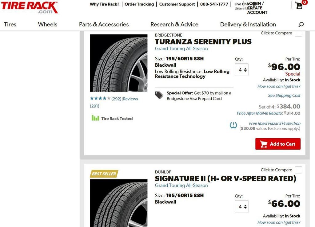
100% easier to read with the big fonts, bright pages and large tire pictures.
But you need to scroll down a lot more and filters are a little more clunky.
Juries out.
But you need to scroll down a lot more and filters are a little more clunky.
Juries out.
Yes, I saw it too! I'm not sure if I like it yet, I'll have to buy some new tires, I guess!...

It's still the same old site using my Safari browser but using Chrome it's much different.

On both IE and Firefox it's exactly the same.
It looks different alright. But is it any better? Dunno...
Same old site here...Windows 8.1 using Chrome

On 10.10.3 Safari is the old site, FireFox is the new site.
I don't know that I'm a fan...
I don't hate it, but if I was asked to pick one I'd say the old one.
I don't know that I'm a fan...
I don't hate it, but if I was asked to pick one I'd say the old one.
prefer the old one myself.
With Google threatening sites with lower search rankings if they don't go mobile-friendly, we're going to see a lot of web site revamps very soon- good, bad, and indifferent.
I think we get used to the old look, the new design is usually get some time to familiar with, that why most don't like newer design.
I had been using FF for more than 8-10 years, I don't like Chrome or IE after tried both for few days. Same for Google map, I hate the new design.
I had been using FF for more than 8-10 years, I don't like Chrome or IE after tried both for few days. Same for Google map, I hate the new design.
why are the BRAND name so small but the MODEL name so big?
Annoying I think. I was like "where the heck is the brand of tire??"
Annoying I think. I was like "where the heck is the brand of tire??"

Last edited:
Oh. I see now. Nothing special. It just looks like a new UI.
It looks like it is intended to appeal to the Millennial generation. Loud, bold text and graphics. Less content. More shazam.
It looks like it is intended to appeal to the Millennial generation. Loud, bold text and graphics. Less content. More shazam.
Originally Posted By: Rand
I have an LG G3 the old site was mobile friendly

But maybe not Google-Mobile-Friendly. Their new specs are brutal.
I have an LG G3 the old site was mobile friendly
But maybe not Google-Mobile-Friendly. Their new specs are brutal.
- Status
- Not open for further replies.
Similar threads
- Replies
- 52
- Views
- 2K
- Replies
- 6
- Views
- 833
- Replies
- 9
- Views
- 394
- Replies
- 8
- Views
- 733
- Replies
- 18
- Views
- 2K