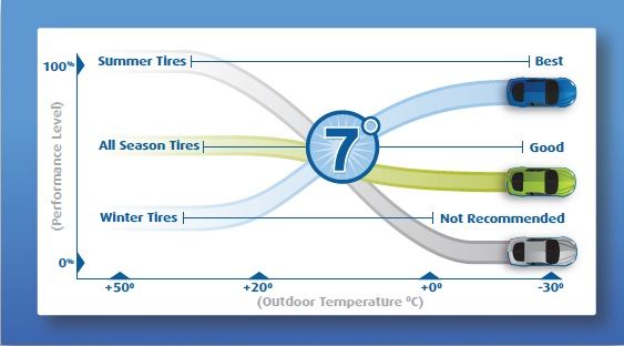
I've been seeing these types of graphs all over the internet on various sites and forums. I find them so generic to the point of being useless. At first glance, they kind of make sense, but the more you think about it, the more ridiculous they seem.
For example:
1. What does "Performance Level" really mean?
2. What does 0% performance mean, like in the case of a summer tire driven in below 0 degree temp? Zero grip? Not true if we're talking about dry pavement.
3. And then there is the winter tire curve which makes it look as if your winter tires magically improve in performance the colder it gets. While I agree with the general notion that winter tires feature special rubber compounds that stay soft at low temperatures, I don't see how that would translate into them actually getting better the colder it gets. If we talk about grip, in my experience winter tires are actually very grippy even during summer, alas, they wear out quickly then of course.
4. Then there is this magical 7 degree C (45F) crossover point where the world gets turned upside down when it comes to all tires. Is it really this clear cut?
Am I wrong on these points? Does this graph make sense to you? Maybe I'm trying to read too much into it...
For the record, I am a strong believer in using the right tires for the conditions. They all have their place. I'm just bothered by this graph somehow.

